

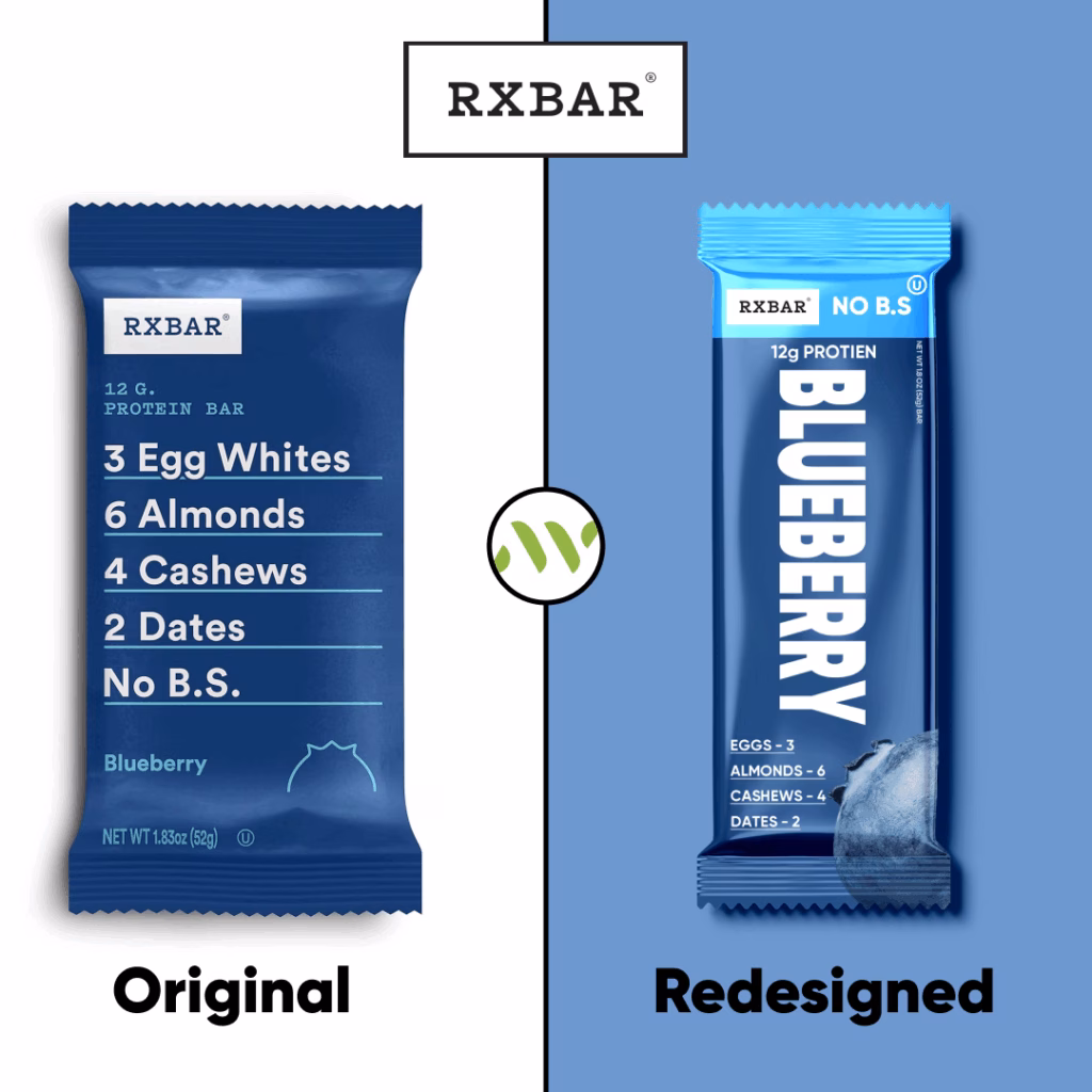
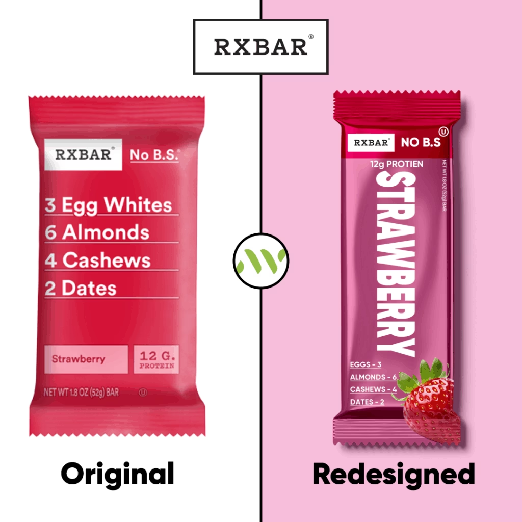
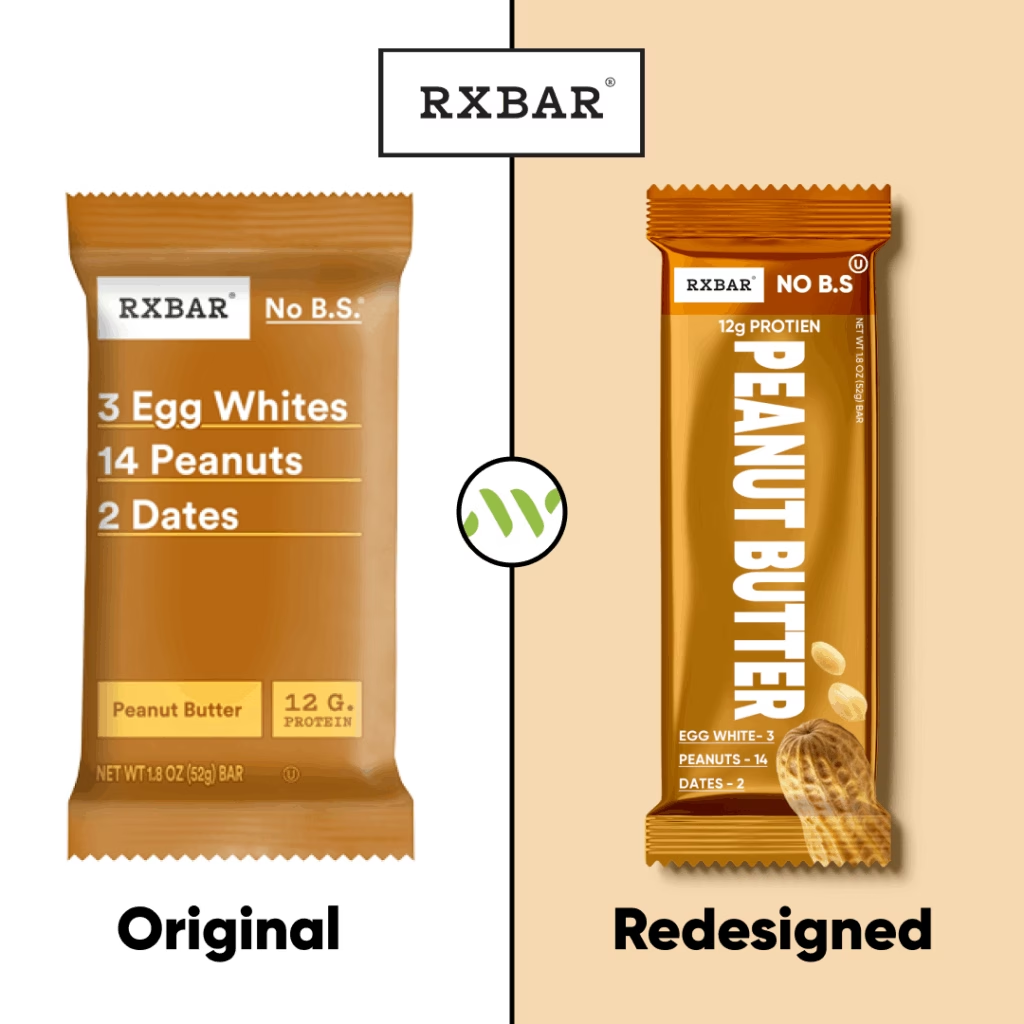
At our agency, we love challenging ourselves with fresh perspectives on existing brands — and this time, we turned our attention to RXBAR, a brand known for its straightforward and no-nonsense approach to snack bar packaging.
This redesign is not commissioned by RXBAR but is a self-initiated case study aimed at exploring new creative directions while respecting the core DNA of the brand.
Our Approach:
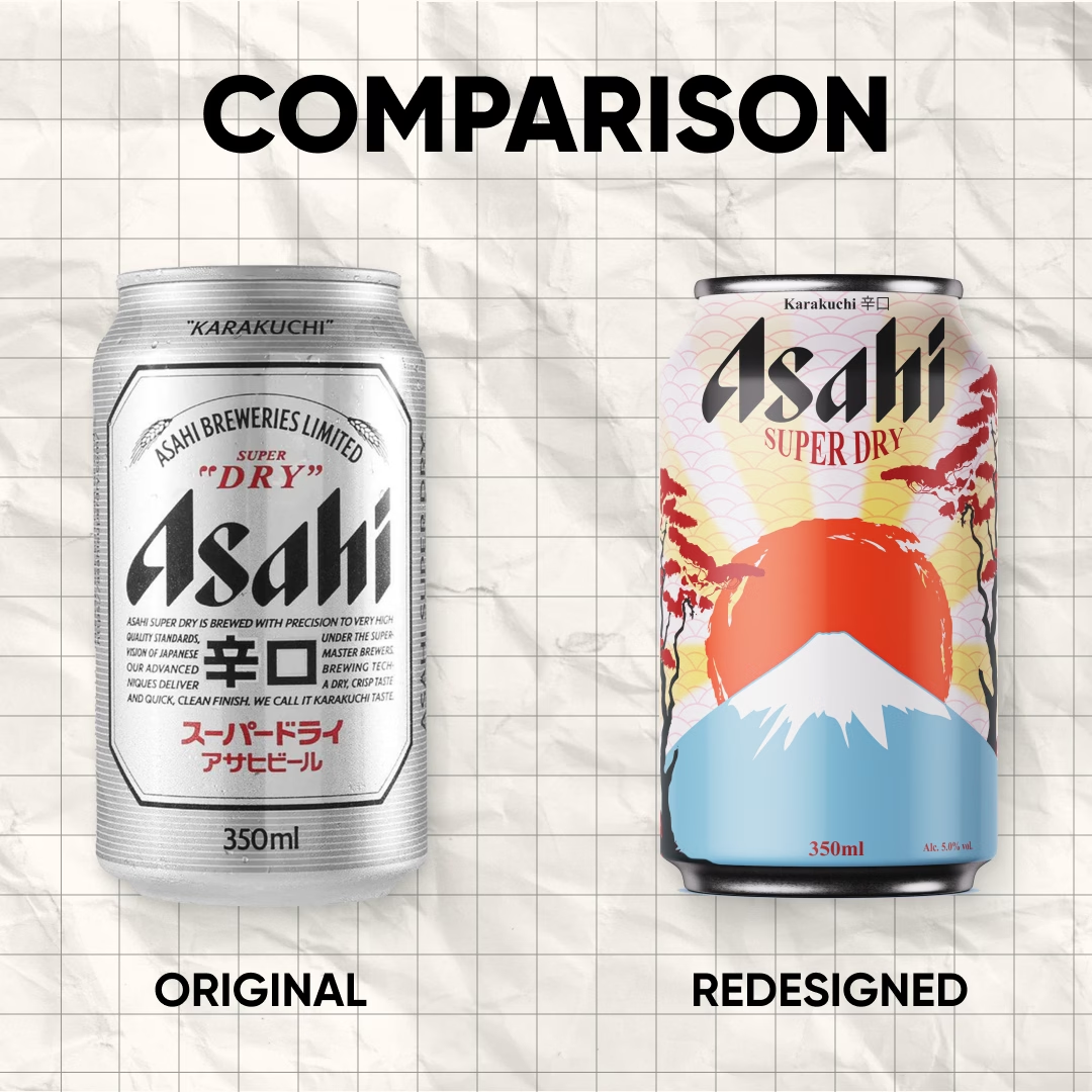
We set out to retain RXBAR’s iconic minimalism but give it a bolder visual twist that could resonate with a modern audience. By using punchy, vibrant color palettes and subtle design enhancements, we aimed to keep the brand’s honest and clean vibe while making it feel more dynamic and shelf-grabbing.
- Clean layout, true to its roots
- Playful color schemes to differentiate flavors
- Modern type styling while maintaining core legibility
- Visual hierarchy optimized for both print and digital display
Why This Redesign?
As part of our ongoing internal projects, we believe in pushing boundaries and asking, “What if?” This speculative redesign gave us the chance to explore what RXBAR could look like with a contemporary refresh that still stays grounded in its minimalist ethos.
Let us know what you think — we’re always excited to hear how others see these reinterpretations of established brands.
